Sunday, November 21, 2021

Update on the Commodities used to Price Producer Milk

Producer milk prices for all four Classes of milk are based on the commodity prices of cheese, butter, dry whey, and nonfat dry milk. Class III milk (the largest use of milk) is priced based on cheese, butter, and dry whey.  Cheese is by far the most important commodity in pricing Class III milk.  This post will cover where cheese and butter prices are going.

The formulas for butterfat, milk protein, and Class III milk are tightly linked to the USDA cheese and butter prices.  These formulas are shown below in their simplified form.  These formulas apply to the producers paid on the Class and Component system which makes up most of the milk in the Federal Orders.  Those paid on the Advanced system do not get paid for protein specifically, so their pricing is based on skim milk and butterfat only.

Butterfat = 1.2 x Butter Price - .21

Milk Protein = 3.2 x Cheese Price - 1.3 x Butter Price - 4.43

Class III Milk = 9.6 x Cheese Price + 5.9 x Dry Whey Price + 0.4 x Butter Price - $3.20

Butterfat pricing is based strictly on the wholesale price of butter.  The formula for milk protein is more complicated.  In that formula, the price of both cheese and butter are used to price milk protein.  They are configured such that when the price of butter gets higher, the price of milk protein goes down.  So, with higher butter prices, the value of butterfat goes up and the price of milk protein goes down.  That is why the most influential commodity for Class III pricing is cheese.  Dry whey has a low value and butter has little impact on the Class III price. The cheese price used in the milk protein and Class III formulas above is calculated based on the wholesale price of Cheddar cheese.

Butterfat pricing will be covered first because it is the easiest to explain.  Chart I shows the relationship between butter inventories and butter prices.  When supplies are scarce, the price is high.  When supplies are more plentiful, the price is lower.  In 2017 through 2019, butter inventories were low, and prices hit record highs.  As inventories increased in 2020 and 2021, the prices fell.

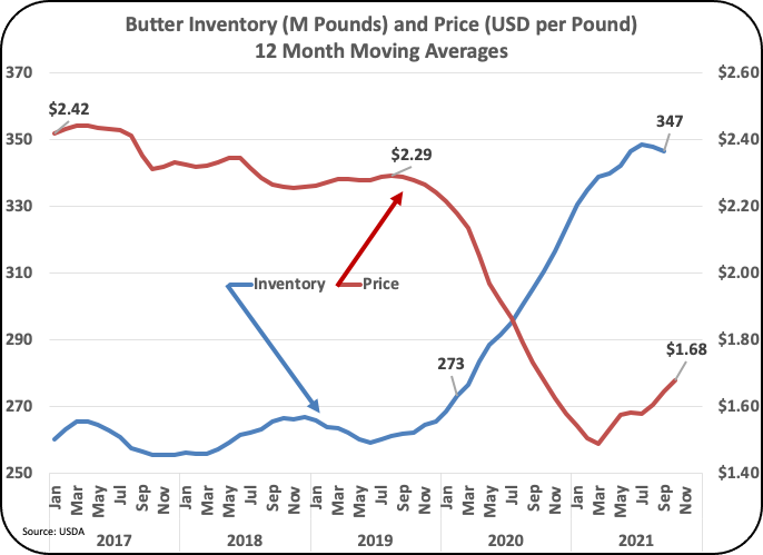
Chart I - Butter Inventories and Pricing

The supply side for butter is based on butter production (churning) shown in Chart II.  Butter production was low in 2019, keeping butter supplies tight.  This changed in 2020 and early 2021 and with higher butter production, inventories grew, and prices fell.  However, in the third quarter of 2021 butter production dropped significantly causing the lower inventory levels and higher prices shown in Chart I.  If lower production continues, it will cause tighter inventories and higher butter prices.

Chart II - Butter Production

Most all butter produced in the U.S. is consumed domestically.  Exports have been very minimal as supplies were limited and prices were high.  With increased production and lower butter prices, exports did expand in 2021.   Chart III below shows the impact of net exports (exports minus imports).  While more butter was exported in 2021, the exports were still overwhelmed by imports, causing the net exports to remain negative.  One of the major imports is Kerry Gold butter imported from Ireland which has gained a major following and significant grocery refrigerated space. 

Chart III - Butter Net Exports

Of all the factors influencing butterfat prices, the production of butter is the most concerning.  Butter production has fallen in 2021 from 209 million pounds in January to 143 million pounds in September.

Milk protein pricing is more complicated.  The pricing is based on the price of Cheddar cheese, for which wholesale inventories levels are not made public, and butter prices, which lower the value of milk protein when the price of butter increases.

Production of Cheddar cheese is increasing, and Cheddar makes up about 70 percent of American cheese production (Chart IV).

Chart IV - Production of Cheddar Cheese

Inventories of American cheese have taken a very bumpy ride especially in 2020 as shown in Chart V.  This Chart represents American cheese inventories, not just Cheddar cheese, but with Cheddar cheese representing 70 percent of American cheese production, American cheese inventory is a good indicator of Cheddar cheese inventories.

Chart V - American Cheese Inventory

Chart VI adds the Agricultural Marketing Service (AMS) cheese pricing to Chart V.  Ignoring some of the "crazy" pricing in 2020 (circled in red in Chart VI), the chart does show the relationship of inventory levels and pricing.  As the American cheese inventory levels have risen (the blue line) the Cheddar pricing has decreased (the red line).

If American cheese inventories continue to grow, cheese pricing will follow its downward trend.

Chart VI - American cheese Inventory and AMS Pricing

Net exports of American cheese amount to about 2.5 percent of American cheese production.  They have been very stable for the last four years, so export fluctuations are not impacting inventory levels.

Chart VII - American Cheese Net Exports

SUMMARY

Butter prices are increasing as production of butter is decreasing.  Exports are never a factor due to tight supplies and high prices.  The decrease in butter production will decrease inventories which will increase prices.  This will increase the value of butterfat, decrease the value of milk protein, and have little impact on Class III milk price.

Production of Cheddar cheese has increased. As a result, inventories of American cheese are growing.  In turn, this has brought a significant decrease in Cheddar cheese prices.  Unless this changes, look for lower AMS cheese prices which will reduce milk protein values and lower Class III prices. 

These trends will continue to be followed through the fourth quarter of 2021 and updated in this blog.


Sunday, November 7, 2021

Milk per Cow is Increasing in These States.

Milk per cow has continued to increase.  Since the beginning of 2018 through September of 2021, monthly milk per cow has increased by 3.9 percent in the U.S.  In 2021, the most recent 12-month average increase is 1.1 percent.  The April 2020 post to this blog has a chart of milk per cow dating back to 2014. Milk per cow was growing by just under one percent per year during the six-year span in that blog. While the overall U.S. growth rate in milk per cow consistently averages around one percent, the variances by state are very different.

Chart I is the 12-month average milk per cow from 2018 through September 2021.  While there have been dips, there is a consistent increase over time.  

Chart I - Milk per cow for the U.S.

Chart II covers the 24 largest milk producing states ordered by highest to lowest in milk per cow.  The difference is dramatic.  Monthly milk per cow by state varies from 1685 to 2266 pounds per month.  Cows in Michigan are producing 34 percent more milk than the cows in Florida.

Chart II - Monthly Milk per Cow by State

Table I below shows the 2021 milk per cow for the five states with the highest milk per cow.  The five states are all well above the U.S. average with Michigan well above all other states.  

Table I - The Top Five States in Milk per Cow

Table II lists the top five states in growth of milk per cow.  By comparison, there were five states with negative or no growth in milk per cow.  The data in this section measures the increases from the end of 2017 to September 2021

Table II - The Top Five Growth States in Milk per Cow

The six major dairy producing states with the fastest growth in milk per cow are shown in Charts III to VI below.

California is the growth leader in milk per cow.  Chart VIII compares the 12-month averages from the end of 2017 to September 2021.  During this time California increased milk per cow by 6.8 percent,

Chart III - California Milk per Cow

Minnesota ranked second in Table II with a 6.1 percent growth over the span of this analysis.

Chart IV - Minnesota Milk per Cow

Texas, Chart IV, has also seen significant growth in milk per cow.  The increases were not as consistent as California or Minnesota, but the results in total were close with a 5.8 percent growth.  Texas has been ranked in the top five in terms of other statistics like the growing number of cows in the state.  The Southwest Federal Order which includes Texas and New Mexico were ranked high in component levels for butterfat and milk protein.

Chart V - Texas Milk per Cow

Wisconsin, which is listed in Table I and Table II, is one of the five highest producing states in milk per cow and is also one of the top five in growth of milk per cow.  Wisconsin is growing by 4.7 percent.

Chart VI - Wisconsin Milk per Cow

Michigan has the highest level of milk per cow as shown in Table I.  When a state is at the top, it's hard to grow as fast as other states, but Michigan still had a 3.3 percent growth in milk per cow since the beginning of 2018.

Chart VII - Michigan Milk per Cow

In prior posts, analysis have been done in detail state-by-state and Federal Order by Federal Order comparing trends and differences.

The July 2021 post analyzed where the cows were moving by state.  Texas is showing the fastest growth.

The October 2021 post covered de-pooling by Federal Order.  California de-pooled 98 percent of their Class III milk in 2021.

The September 26 post covered the increases in cheese production state by state.  Cheese production is increasing by 2.8 percent annually overall.  South Dakota increased cheese production by 29 percent over the last three years.

The October 14 post covered the increase in component levels.  Butterfat levels were increasing from 3.88 percent in 2020 to 3.94 percent in 2021.  Protein levels increased from 3.14 percent in 2020 to 3.18 percent in 2021.  The Southwest, Texas and New Mexico, had the highest butterfat and protein levels. 

The huge geographical difference in milk per cows is puzzling, as the improvements made in some areas do not seem to be implemented in other areas.   Comments on the differences are encouraged.