Saturday, December 18, 2021

The Uniform Price

What is the "Uniform" price for producer milk?  The Uniform Milk Price is the weighted average price of all producer milk used in all classes, sometimes referred to as the "Blend" Price.  It is an index calculated for each Federal Order.  It is like the announced index prices for Class I, II, III, and IV which are standardized prices.  The difference is that the "Uniform" price is calculated for each Federal Order and each Federal Order has a different value.  

The Class III price that is announced each month is an index.  No one is really paid this specific amount for milk going to cheese.  Producers are paid initially by the amount of butterfat, milk protein, and other solids.   The standardized Class III price is based on milk with 3.5 percent butterfat, 3.0 percent milk protein, and 5.7 percent other solids.  Similarly, the Uniform price is based on the Class III price plus the Producer Price Differential at 3.5 percent butterfat for a specific Federal Order.  The Uniform price is an index to measure the standard value of milk paid in a specific Federal Order.

As an example, in August 2019 the Uniform price based on 3.5 percent butterfat and 3.0 percent protein for California was $17.84 per cwt.  If the Uniform price had been based on actual component levels, the Uniform price would be $18.62 per cwt.  Component levels have been steadily increasing.

What makes the Uniform price different between Federal Orders?  As covered in the prior post, the mix of milk Classes in each order will provide a different average value.  More Class I milk brings higher Uniform prices.  Also, significant de-pooling in the Federal Orders will significantly change the Uniform price.

Below is a table of the 2021 YTD through October Uniform prices for each Federal Order.  They are ranked highest to lowest.  Florida is always the highest because they are almost exclusively Class I milk.  California is at the bottom of the list due to their large amount of Class IV milk.

Table I - Uniform prices for 2021 YTD

Below are charts for the same Federal Orders used in the prior post for Producer Price Differentials.  They are shown in order of their 2021 Uniform price.  

Chart I displays the Northeast Federal Order which has a balanced mix of all classes of milk and minimal de-pooling.  The spread is $3.63 per cwt. with a high in December 2019 of $19.28 per cwt. to a low of $15.66 per cwt. in June 2020.  The Northeast Order spread is the lowest of the four Federal Orders covered below.

Chart I - Uniform Prices for the Northeast Federal Order

The Southwest Federal Order, Chart II, has a spread from high to low of $5.68 per cwt.  The lowest price was $13.01 per cwt. which occurred in May 2020.  In May, only 5 percent of the milk was Class III milk due to significant de-pooling.  When high paid milk is de-pooled, the remaining milk in the Federal Order will average lower prices. 

Chart II - Uniform Prices for the Upper Midwest Federal Order

The Uniform price in the Upper Midwest, Chart III, has a spread of $7.20 per cwt. which is the largest spread of all the four Federal Orders reviewed here.  The Upper Midwest Federal Order is largely Class III milk for cheese.  In May 2020, the Class III price was $12.14 per cwt.  In July 2020 the Class III price jumped up to $24.54.  The huge volatility was due to cheese price fluctuations caused by COVID "stay as home" mandates. 

Chart III - Uniform Prices for the Upper Midwest Federal Order 

California milk prices had a $5.89 per cwt. spread.  August of 2019 reached a high of $17.84 per cwt.  despite significant de-pooling of Class III milk.   May 2020 was the lowest at $11.95 per cwt.  The huge amount of low-priced Class IV milk has kept California's Uniform price low.

Chart IV - Uniform Prices for California Federal Order

What does all this mean?  The math and policies of Federal Order milk payments are causing huge differences in milk payments. The payment a producer receives for his milk in a Federal Order is controlled by these variables.
  1. Producers in the Class and Component system are initially paid based on the components in their delivered milk.   Component levels were reviewed in this recent post.  The producer does have control over his component levels.  But the following three variables are not under a producer's control.
  2. The price of each component in a producer's milk is determined by Agricultural Marketing Service and they are based on the values of cheese, NDM, butter, and dry whey.  The price of the commodities used to price components is based on supply and demand.  The linkage between commodities and component prices was covered in this recent post.  
  3. The amount of de-pooling in a Federal Orders is managed by the cooperatives, handlers and the specific de-pooling rules of each specific Federal Order.  De-pooling has been huge as covered in this recent post.  When the Class III prices are high, much of the milk is de-pooled to avoid a negative PPD.  This will lower the revenue for those producers left in the Federal Order pool.
  4. The mix of milk classes varies significantly in the Federal Orders.  See this post on the impact of various milk classes in the different Federal Orders.
Is this really the way a producer should be paid for his milk?  The March post to this blog discussed some alternatives.  Questions have also been raised concerning the value of even having Federal Orders.

This will be the last post for 2021, but more will be coming 2022.  Enjoy the holidays.


Sunday, December 5, 2021

Producer Price Differentials are Positive! Why?

This post will examine the volatile changes in Producer Price Differentials (PPDs).  PPDs are intended to provide a level revenue for milk within a Federal Order so producers for all Classes of milk receive equal pay.  The volatility of the PPDs has been extreme. For much of 2020, the PPD was drastically negative, reducing payments for producer milk and increasing de-pooling.  They have now become positive.  Why did they change?  This post will build on the prior post which covered the price changes in commodities used to price producer milk.  The next post will take this subject one step further to track the impact on the Uniform (average) price for producer milk.

Producers in the Federal Orders paid on the Class and Component system are first paid for the components they deliver.  Later, the Uniform price for the Federal Order is calculated and the PPD is the difference between the first payment and the Uniform price.  As will be covered below, the PPD changes are closely related to the price of Class III skim milk used for cheese and Class IV skim milk used for nonfat dry milk (NDM).

This post will review the PPDs in four of the large Federal Orders, and then compare them to changes in Class III and Class IV skim milk prices.  In turn, the commodities that price Class III and Class IV skim milk, cheese and NDM, will be compared to the Class III and Class IV skim milk prices.  The linkage between the PPD changes and the price of cheese and NDM and is very tight.

THE  PPDs IN FOUR OF THE LARGE FEDERAL ORDERS

There are four charts below which show the PPD for 2019, 2020, and 2021 YTD in four of the largest Federal Orders.  All these charts have the same shape, but due to the mix of milk Classes they will vary in amount.  In 2020, there were major negative PPDs, with California having PPDs which reached close to a negative $10 per cwt.  While the PPDs have come back to positive numbers, they have not reached 2019 levels.

The Northeast Federal Order (Chart I) has a balanced mix of Classes of milk and minimal de-pooling. It typically has positive PPDs.  However, in 2020, the PPD fell to negative levels of more than $5 per cwt.

Chart I - PPDs for the Northeast Federal Order.

The Upper Midwest Order (Chart II) has a milk Class balance strongly skewed to Class III milk.  For that reason, the PPD is typically very small.  However, in 2020 they also experienced a strong negative PPD because the cheese price was very high and because much of the Class III milk was de-pooled.  In early 2021, the PPD remained negative initially, but has had some positive months in the third quarter.

Chart II - PPDs for the Midwest Federal Order

The Southwest Federal Order, which has become strongly oriented to Class III milk, has also experienced strongly negative PPDs in 2020.

Chart III - PPDs for the Southwest Federal Order.

California has a large volume of Class IV milk which drove PPDs very negative in 2020.  During 2020, almost all the Class III milk was de-pooled.  Low international prices for NDM kept the Class IV skim prices low.

Class IV - PPDs for the California Federal Order

CHANGES IN CLASS III AND CLASS IV PRICES

What has caused these huge fluctuations in PPDs?  The explanation is simple.  It is caused by the variation in Class III and Class IV skim milk prices.  Chart V shows the differential between Class IV and Class III skim milk prices.  This chart has a high correlation to the PPDs in Charts I through IV above.  The correlation can easily be seen by visually comparing the charts.

Chart V - Differential between Class III and Class IV milk prices

Charts VI and VII below show the movement of Class III and Class IV skim milk prices.  In 2020, Class III skim prices hit record highs while Class IV skim prices fell to extreme lows.  In 2021, Class III prices have stabilized, and Class IV prices have risen.

The low Class III skim prices in early 2019 allowed the PPDs to remain positive because the initial payment for components was less than the Uniform price.  The very high Class III skim prices in 2020 led to extremely negative PPDs.

Chart VI - Class III Skim Milk Prices

Class IV skim prices hit lows in 2020 but have continued to increase in 2021 allowing the PPDs to become marginally positive.  The Class IV skim price is now nearly double the 2020 low.  However, the Class IV skim price remains lower than Class III skim price.

Chart VII - Class IV Skim Milk Prices

CHANGES IN THE COMMODITIES USED TO PRICE MILK

Drilling down further, what makes the Class III and Class IV skim prices change?  Again, it is pretty simple.  

The AMS cheese price as discussed in the prior post is shown in Chart VIII.  Comparing the Class III skim price (Chart VI) above to the price of cheese (Chart VIII), it is obvious that the two are strongly correlated and that the cheese price drives the Class III price.

Chart VIII - Cheese Prices used to Calculate Class III Skim Prices

Chart IX below is the price of NDM.  Comparing it to Chart VII, the price of Class IV skim milk, the two look identical.  The price of NDM clearly drives the price of Class IV skim milk.

Chart IX - NDM Prices used to Calculate Class IV Skim Prices

So, the PPD is really driven by the comparative prices of cheese and NDM.  However, there is one very big difference in the factors used to price cheese and NDM.  Cheese pricing is driven by domestic events, like consumption, production, and inventories.  NDM pricing is primarily an export item and is driven by global events.  In a sense, NDM is a byproduct of butter production.  It has to be priced to sell and is subject to global competition, exchange rates, political issues, and other global factors.  

With the May 2019 formula change for Class I, NDM prices are nearly as important in pricing producer milk as the price of cheese.  The NDM price is used for Class II and Class IV skim milk and now shares the input for Class I pricing.

The next post will cover the Uniform price within the leading Federal Orders.  The Uniform price is what the producer really receives with a few adjustments.

As always, written comments are welcome and encouraged.  To reach the author by telephone, call 404-375-3510.

Sunday, November 21, 2021

Update on the Commodities used to Price Producer Milk

Producer milk prices for all four Classes of milk are based on the commodity prices of cheese, butter, dry whey, and nonfat dry milk. Class III milk (the largest use of milk) is priced based on cheese, butter, and dry whey.  Cheese is by far the most important commodity in pricing Class III milk.  This post will cover where cheese and butter prices are going.

The formulas for butterfat, milk protein, and Class III milk are tightly linked to the USDA cheese and butter prices.  These formulas are shown below in their simplified form.  These formulas apply to the producers paid on the Class and Component system which makes up most of the milk in the Federal Orders.  Those paid on the Advanced system do not get paid for protein specifically, so their pricing is based on skim milk and butterfat only.

Butterfat = 1.2 x Butter Price - .21

Milk Protein = 3.2 x Cheese Price - 1.3 x Butter Price - 4.43

Class III Milk = 9.6 x Cheese Price + 5.9 x Dry Whey Price + 0.4 x Butter Price - $3.20

Butterfat pricing is based strictly on the wholesale price of butter.  The formula for milk protein is more complicated.  In that formula, the price of both cheese and butter are used to price milk protein.  They are configured such that when the price of butter gets higher, the price of milk protein goes down.  So, with higher butter prices, the value of butterfat goes up and the price of milk protein goes down.  That is why the most influential commodity for Class III pricing is cheese.  Dry whey has a low value and butter has little impact on the Class III price. The cheese price used in the milk protein and Class III formulas above is calculated based on the wholesale price of Cheddar cheese.

Butterfat pricing will be covered first because it is the easiest to explain.  Chart I shows the relationship between butter inventories and butter prices.  When supplies are scarce, the price is high.  When supplies are more plentiful, the price is lower.  In 2017 through 2019, butter inventories were low, and prices hit record highs.  As inventories increased in 2020 and 2021, the prices fell.

Chart I - Butter Inventories and Pricing

The supply side for butter is based on butter production (churning) shown in Chart II.  Butter production was low in 2019, keeping butter supplies tight.  This changed in 2020 and early 2021 and with higher butter production, inventories grew, and prices fell.  However, in the third quarter of 2021 butter production dropped significantly causing the lower inventory levels and higher prices shown in Chart I.  If lower production continues, it will cause tighter inventories and higher butter prices.

Chart II - Butter Production

Most all butter produced in the U.S. is consumed domestically.  Exports have been very minimal as supplies were limited and prices were high.  With increased production and lower butter prices, exports did expand in 2021.   Chart III below shows the impact of net exports (exports minus imports).  While more butter was exported in 2021, the exports were still overwhelmed by imports, causing the net exports to remain negative.  One of the major imports is Kerry Gold butter imported from Ireland which has gained a major following and significant grocery refrigerated space. 

Chart III - Butter Net Exports

Of all the factors influencing butterfat prices, the production of butter is the most concerning.  Butter production has fallen in 2021 from 209 million pounds in January to 143 million pounds in September.

Milk protein pricing is more complicated.  The pricing is based on the price of Cheddar cheese, for which wholesale inventories levels are not made public, and butter prices, which lower the value of milk protein when the price of butter increases.

Production of Cheddar cheese is increasing, and Cheddar makes up about 70 percent of American cheese production (Chart IV).

Chart IV - Production of Cheddar Cheese

Inventories of American cheese have taken a very bumpy ride especially in 2020 as shown in Chart V.  This Chart represents American cheese inventories, not just Cheddar cheese, but with Cheddar cheese representing 70 percent of American cheese production, American cheese inventory is a good indicator of Cheddar cheese inventories.

Chart V - American Cheese Inventory

Chart VI adds the Agricultural Marketing Service (AMS) cheese pricing to Chart V.  Ignoring some of the "crazy" pricing in 2020 (circled in red in Chart VI), the chart does show the relationship of inventory levels and pricing.  As the American cheese inventory levels have risen (the blue line) the Cheddar pricing has decreased (the red line).

If American cheese inventories continue to grow, cheese pricing will follow its downward trend.

Chart VI - American cheese Inventory and AMS Pricing

Net exports of American cheese amount to about 2.5 percent of American cheese production.  They have been very stable for the last four years, so export fluctuations are not impacting inventory levels.

Chart VII - American Cheese Net Exports

SUMMARY

Butter prices are increasing as production of butter is decreasing.  Exports are never a factor due to tight supplies and high prices.  The decrease in butter production will decrease inventories which will increase prices.  This will increase the value of butterfat, decrease the value of milk protein, and have little impact on Class III milk price.

Production of Cheddar cheese has increased. As a result, inventories of American cheese are growing.  In turn, this has brought a significant decrease in Cheddar cheese prices.  Unless this changes, look for lower AMS cheese prices which will reduce milk protein values and lower Class III prices. 

These trends will continue to be followed through the fourth quarter of 2021 and updated in this blog.


Sunday, November 7, 2021

Milk per Cow is Increasing in These States.

Milk per cow has continued to increase.  Since the beginning of 2018 through September of 2021, monthly milk per cow has increased by 3.9 percent in the U.S.  In 2021, the most recent 12-month average increase is 1.1 percent.  The April 2020 post to this blog has a chart of milk per cow dating back to 2014. Milk per cow was growing by just under one percent per year during the six-year span in that blog. While the overall U.S. growth rate in milk per cow consistently averages around one percent, the variances by state are very different.

Chart I is the 12-month average milk per cow from 2018 through September 2021.  While there have been dips, there is a consistent increase over time.  

Chart I - Milk per cow for the U.S.

Chart II covers the 24 largest milk producing states ordered by highest to lowest in milk per cow.  The difference is dramatic.  Monthly milk per cow by state varies from 1685 to 2266 pounds per month.  Cows in Michigan are producing 34 percent more milk than the cows in Florida.

Chart II - Monthly Milk per Cow by State

Table I below shows the 2021 milk per cow for the five states with the highest milk per cow.  The five states are all well above the U.S. average with Michigan well above all other states.  

Table I - The Top Five States in Milk per Cow

Table II lists the top five states in growth of milk per cow.  By comparison, there were five states with negative or no growth in milk per cow.  The data in this section measures the increases from the end of 2017 to September 2021

Table II - The Top Five Growth States in Milk per Cow

The six major dairy producing states with the fastest growth in milk per cow are shown in Charts III to VI below.

California is the growth leader in milk per cow.  Chart VIII compares the 12-month averages from the end of 2017 to September 2021.  During this time California increased milk per cow by 6.8 percent,

Chart III - California Milk per Cow

Minnesota ranked second in Table II with a 6.1 percent growth over the span of this analysis.

Chart IV - Minnesota Milk per Cow

Texas, Chart IV, has also seen significant growth in milk per cow.  The increases were not as consistent as California or Minnesota, but the results in total were close with a 5.8 percent growth.  Texas has been ranked in the top five in terms of other statistics like the growing number of cows in the state.  The Southwest Federal Order which includes Texas and New Mexico were ranked high in component levels for butterfat and milk protein.

Chart V - Texas Milk per Cow

Wisconsin, which is listed in Table I and Table II, is one of the five highest producing states in milk per cow and is also one of the top five in growth of milk per cow.  Wisconsin is growing by 4.7 percent.

Chart VI - Wisconsin Milk per Cow

Michigan has the highest level of milk per cow as shown in Table I.  When a state is at the top, it's hard to grow as fast as other states, but Michigan still had a 3.3 percent growth in milk per cow since the beginning of 2018.

Chart VII - Michigan Milk per Cow

In prior posts, analysis have been done in detail state-by-state and Federal Order by Federal Order comparing trends and differences.

The July 2021 post analyzed where the cows were moving by state.  Texas is showing the fastest growth.

The October 2021 post covered de-pooling by Federal Order.  California de-pooled 98 percent of their Class III milk in 2021.

The September 26 post covered the increases in cheese production state by state.  Cheese production is increasing by 2.8 percent annually overall.  South Dakota increased cheese production by 29 percent over the last three years.

The October 14 post covered the increase in component levels.  Butterfat levels were increasing from 3.88 percent in 2020 to 3.94 percent in 2021.  Protein levels increased from 3.14 percent in 2020 to 3.18 percent in 2021.  The Southwest, Texas and New Mexico, had the highest butterfat and protein levels. 

The huge geographical difference in milk per cows is puzzling, as the improvements made in some areas do not seem to be implemented in other areas.   Comments on the differences are encouraged.


Sunday, October 24, 2021

Component Levels are Rising. FAST!

Component levels in producer milk have been slowly but steadily increasing for years.  Now, the growth in component levels is growing much faster. Technology to increase component levels is available and improving.  Producers and nutritionists are implementing these practices at an accelerating rate.  The data used in this analysis is for pooled Class III milk.

Chart I covers the years from 2018 through August of 2021 with data based on 12-month moving averages.  During this time, butterfat levels have increased from 3.81 percent to 3.96 percent.  Butterfat prices were at historically high levels in 2018 and 2019, starting at $2.61 per pound, but have fallen to more normal levels and are currently at $1.75 per pound.  Butterfat percentage set a record in the Southwest Federal Order in February 2021 at 4.25%.

Chart I - Butterfat Percentage and Prices

Chart II presents the same data for milk protein.  Milk protein levels have experienced a bumpy ride, but protein levels are now increasing very fast.  The growth in 2021 compared to 2020 is from 3.18 percent to 3.20 percent.  The price of milk protein has also been a bumpy road.  Over the span from 2018 to August 2021, the 12-month average price has increased from $1.83 per pound to $3.21 per pound.  The highest monthly percent for milk protein was also achieved by the Southwest Federal Order at 3.38 percent in January 2021.

Chart II - Milk Protein Percentage and Prices

Individual Federal Orders show major differences (Chart III).  The Southwest Federal Order has increased butterfat levels steadily from 2018 to the present and is clearly the leader in butterfat levels with a 12-month average currently at 4.12 percent. The other five Federal Orders have all significantly increased butterfat levels in 2021, setting record levels for their individual Orders.

Chart III - Butterfat Percentages by Federal Order,

The growth in 2021 can be clearly seen in Table I below.  The numbers in Table I are the eight-month averages for 2020 and 2021.  The Upper Midwest Order is increasing butterfat percentage faster than any other order.  For the first eight months of 2021 compared to the first eight months of 2020, the upper Midwest butterfat averages increased by .10 percent.  The Southwest, Northeast, Mideast and Central Federal Orders also had very nice increases ranging from .06 percent to .08 percent.

The four Federal Orders paid by the Advanced system had the lowest butterfat levels and the smallest increases in butterfat levels.  All Federal Orders get paid for butterfat.  Those Federal Orders having the lowest levels of butterfat have an opportunity to increase butterfat and revenue with proven practices.

Table I - Growth of Butterfat Percent by Federal Order.

Milk protein for the seven Federal Orders paid for butterfat, milk protein, and other solids is shown graphically in Chart IV.  The Pacific Northwest has had the highest protein levels for years, but it has now slipped to second place behind the Southwest. The second to the lowest protein levels are in the Upper Midwest, where most of the milk is used for cheese and there is vast de-pooling.  

Chart IV - Protein Percentages by Federal Order

Table II displays the milk protein levels for 2020 and 2021 by Federal Order.  The Southwest, California, and Northeast Federal orders have improved protein by .05% in 2021 over the prior year.  The Mideast, Central, and the Pacific NW increased protein by slightly less.  

Amazingly, the Upper Midwest where nearly 90 percent of the milk is used for cheese which needs high protein levels for efficient production has the lowest protein percentage and the lowest increase in protein levels, comparing 2021 to 2020.  This is an opportunity for producers in the Upper Midwest.

Table II - Growth of Protein Percentage by Federal Order

SUMMARY

The Southwest, which was ranked highest in the recent post on "Where are the Cows Going?" again comes out at the top of the analysis in this blog post.  The Southwest is a model for other Federal Orders.  

The Upper Midwest is at the top of the charts in percent growth of butterfat, but it is at the bottom of the charts for protein.  This seems very strange for a Federal Order primarily supplying cheese plants and creates another great opportunity.  Balanced feeds to increase milk protean also generally increase butterfat.

The lack of butterfat in the Orders paid by the Advanced system is also an opportunity for producers to increase butterfat.  They are paid for each pound of butterfat, and making more butterfat increases revenue.

Overall, the 2021 increases are record setting and demonstrate the potential for increasing components and revenue.  As an example, a producer with one thousand cows producing 80 pounds of milk per cow per day who increased component levels at the averages in the Tables I and II, would increase revenue by $68,000 a year.

Sunday, October 3, 2021

How Much Milk is Being De-pooled? Lots!

In the Federal Milk Marketing Orders (FMMO), Class I milk for drinking cannot be de-pooled.  However, all other Classes of milk can be de-pooled.  When milk is de-pooled, it is not counted in the Federal Order statistics and it is not subject to the Federal Order processes, pricing, or statistics.

When is milk de-pooled?  When it is advantageous financially, milk will be de-pooled.  As an example, when the Class III milk is higher priced than the Class I milk the Producer Price Differential (PPD) will likely be negative.  To avoid a negative PPD, the Class III milk will be de-pooled.  When milk is de-pooled, it is not subject to Federal Order pricing, but Federal Order pricing nevertheless is typically used for the de-pooled milk.

How much milk is being de-pooled?  It varies by Federal Order as the de-pooling rules and Class usage mix varies among Federal Orders.  This post will review de-pooling of Class III milk in four of the major Federal Orders.  This includes California, the Southwest, the Upper Midwest, and the Northeast Orders.

The analysis is based on state-by-state cheese manufacturing data used in the prior post.  The amount of Federal Order cheese produced is estimated by totaling the states or partial states included in each Federal Order.  The amount of milk used for cheese is estimated based on a conversion of eight pounds of milk for each pound of cheese.  That amount of milk needed for cheese production is then compared to the amount of Class III milk listed by that Federal Order.  The data used is for the first seven months of 2021.

This allows a comparison of milk used for cheese compared to the amount of Class III milk listed for a specific Federal Order.  These comparisons are not an exact science.  The ratio of milk to cheese can vary, the timing of milk shipped vs. when cheese is made can vary, and the state vs. Federal Order boundaries can vary.  Nevertheless, by using seven months averaging, a reasonably accurate calculation of de-pooling can be developed.  

Why did California become a Federal Order?  In hindsight, the ability to de-pool seems to be a big factor.  Since the first months of becoming a Federal Order, massive de-pooling has occurred.  So far in 2021, 98 percent of the Class III milk was de-pooled in California.  That amounts to 11.1 billion pounds of Class III milk that was de-pooled in the first seven months of 2021 in the California Federal Order.

The Southwest Federal Order also had major de-pooling.  The Southwest Order is composed of New Mexico and Texas.  In the first seven months of 2021, the Southwest de-pooled 5.7 billion pounds of Class III milk, which is 93 percent of the Class III milk.  

The Upper Midwest produces mostly Class III milk for cheese.  Therefore, the Class III price and the "Uniform" or average price are typically very close.  The amount of the PPD is very small with only a few exceptions.  In 2021 through July, the Upper Midwest de-pooled 82 percent of their Class III milk.  By the calculations used for this post, 17.9 billion pounds of Class III milk were de-pooled in the first seven months of 2021.  The Upper Midwest is the only Federal Order that estimates the amount of de-pooled milk every month and their published estimates totaled 18.5 billion pounds of milk de-pooled in the first seven months of 2021, close to the estimate developed for this post.  The difference between the two estimates is just three percent which adds credibility to both de-pooling estimates.

De-pooling in the Northeast Federal Order is a little more difficult.  Nevertheless, 33 percent of the Class III milk was de-pooled.  This amounts to two billion pounds of de-pooled milk in the first seven months of 2021. 

WHAT DOES IT ALL MEAN?

The table below summarizes the estimated de-pooling in the four largest cheese producing Federal Orders.  In total for the first seven months of 2021, 81 percent of the Class III milk in these orders was de-pooled.  Milk for cheese is the largest use of milk in the U.S.  

If Idaho, the third largest cheese producing state was included, the amount of milk for cheese not included in Federal Order pricing would jump from 81 percent to 87 percent.  Idaho is not in any Federal Order.  These four Federal Orders covered and Idaho together make up 80 percent of the U.S. cheese production.

Estimated De-pooling in the Four Largest FMMOs

With most of Class III milk being de-pooled, does this mean the Federal Order system of payments is broken and out-of-date?  Does it need revision?  Does it serve any purpose or is it just wasted bureaucratic overhead?  This post will not attempt to answer these questions, but comments are welcome.

When de-pooling occurs, it does not create value, it only spreads the wealth differently.  Those who de-pool make more money, and those that are left in the pool make less.  


Sunday, September 26, 2021

Where is Cheese Production Going? Out of California!

This post will explore where cheese production is going in the U.S.  The data in this post is based on monthly cheese production by state from 2019 to July 2021.  Growth is measured by comparing the first seven months of 2019 to the first seven months of 2021.   In many ways, this post compliments the July 11 post on "Where are the Cows Going?".

Most of the large cheese producing states are growing at about 1.5 percent annually except for California which is decreasing by 1.6 percent.  South Dakota had growth of 29 percent per year, far greater than any other state.  The states with fewer than three cheese plants are not reported separately, but they have collectively grown by 7.7 percent.

In the next post to this blog, much of this data will be used to estimate de-pooling in the Federal Orders.  If milk is sold to a cheese plant in a Federal Order, it would be included in the Class III milk usage unless it was de-pooled.  The difference between the milk used for cheese and the amount of Class III milk reported by the Federal Order will be used as an estimate of de-pooling in the Federal Orders.

As shown in Chart I, cheese production in the U.S. is growing at about 2.8 percent annually.  The 2021 increase over 2019 is 60 million pounds per month.  That is more than domestic consumption is growing and is resulting in swelling cheese inventories.  

Chart I - USA Cheese Production

The seven largest cheese producing states will be reviewed individually.  They are listed in order from the largest cheese producing state to the smallest of the seven. 

Wisconsin, Chart II below, is the largest cheese producing state and produced a monthly average of 286 million pounds for the first seven months of 2021.  Wisconsin increased cheese production by eight million pound over the last two years. The annual growth in cheese production over the last two years is 1.4 percent which is less than the national average of 2.8 percent.  

Chart II - Wisconsin Cheese Production

California, Chart III, is the second largest cheese producing state with 2021 YTD production of 204 million pounds per month.  Production of cheese in California is falling at an annual rate of 1.6 percent.  That is a loss of eight million pounds per month between 2019 and 2021.  Even if this shrinking continues, California will remain the second largest cheese producing state for a very long time.

Chart III - California Cheese Production

Idaho, Chart IV, is the third largest cheese producing state with 2021 YTD production of 84 million pounds per month.  Idaho is not in a Federal Order.  Their current growth rate over the last two years is just .6 percent annually.

Chart IV - Idaho Cheese Production

New Mexico, Chart V, is continuing to increase cheese production.  The annual rate of increase over the last two years is 1.3 percent. Currently New Mexico is producing an average of 80 million pounds of cheese per month.

Chart V - New Mexico Cheese Production

New York state, Chart VI, is currently growing cheese production at 1.6 percent annually.   In 2021 YTD, New York state has average of 71 million pounds per month.

Chart VI - New York state Cheese Production

Minnesota, Chart VII, is growing by 1.2 percent annually.  Minnesota has grown significantly in the last year, reaching record levels in the last months of 2020.  In 2021, cheese production has averaged 63 million pounds per month.  Minnesota is now the sixth largest cheese producing state.

Chart VII - Minnesota Cheese Production

South Dakota, Chart VIII, is by far the fastest growing cheese producing state in the U.S. with an annual growth rate of 29 percent.  There have been some major expansions of cheese plants in South Dakota which increased cheese production over the last two years by eight million pounds per month.  The cheese plants in South Dakota are largely in the Eastern part of South Dakota which is in the Upper Midwest Federal Order.

Chart VIII South Dakota Cheese Production

One of the major changes is in the states with less than three cheese plants (Chart IX).  Their growth of 7.7 percent annually is a significant trend.  Over the last two years these states increased cheese production by 22 million pounds which was 37 percent of the total U.S. increase in cheese production.  There is no publicly available data for these individual states, but one of these states is Texas which is home to one of the largest cheese plants in the U.S.

Chart IX - The States with Fewer than Three Cheese Plants

In summary, California is losing significant cheese production while the U.S. overall is growing in cheese production.  The fastest growing cheese producing state is South Dakota. While Wisconsin increased cheese production by 1.3 percent, the Upper Midwest area which includes Wisconsin, Minnesota and part of South Dakota is growing at an estimated 3.3 percent annually.

The next post will use the data on cheese production to estimate de-pooling in 2021 YTD in the major Federal Orders.  Will it be de-pooling by 20 percent, 50 percent, or maybe 80 percent?  Don't miss the next post!  You may be surprised.

Monday, September 13, 2021

Long Term Trends in Milk Pricing

This post will review the changes in producer milk prices since the introduction of the current Class and Component pricing system which was introduced in January 2000.  After nearly 22 years, what way are producer milk prices moving?  All charts in this post are based on 12 month moving averages.  Since 2000, inflation has increased by 50 percent.  Have dairy prices increased the same?

AN OVERVIEW

Table I shows the five-year average prices of the commodities used to price producer milk.  The years 2010 to 2015 produced excellent prices for all four commodities.  It could be described as the "golden years" for milk pricing.  During the five years from 2015 to 2020, butter increased to extremely high prices averaging $2.45 per pound.  In turn this drove down the price of milk protein.  (See the prior post for an explanation of why this occurs.). 

In the last 20 months, milk protein has recovered to new price highs averaging $3.36 per pound.  Producing maximum protein is a strong revenue generator for those paid on the Class and Component system.

Currently dairy prices are all falling from their highs except for milk protein.

Table I - Five Year Average Prices of Dairy Commodities

The long-term trends shown in Chart I explain some of the reason for low and negative Producer Price differentials.  The Class I prices in Chart I are the Base Class I skim prices.  In 2000 when the payment system was implemented, Class III skim milk (the blue line) was the lowest paid.  Therefore, the initial payment was well under the average price and Producer Price Differentials (PPDs) were positive.  Currently, Class III skim milk is the highest paid.  Class IV skim milk was high in the early years, but now is the lowest paid milk.  To review the changing PPDs. click on this link.

The clear conclusion from this is that the system developed in the late 1900s and implemented in January 2000 has not changed much.  Does it need a complete revision?  See some thoughts on this in a prior post to this blog.

Chart I - 22 Year Trends
  1. First to be reviewed with be the pricing trends of the commodities that are surveyed by the Agricultural Marketing Service.  These include cheese, butter, dry whey, and nonfat dry milk (NDM).
  2. In turn, how have these commodities influenced the values of milk protein, butterfat, other solids and the skim price of Class IV milk.
  3. The final charts will review the long-term trends of Class I, III, and IV milk prices

COMMODITIES USED TO PRICE MILK

Cheese prices have averaged $1.59 per pound over the full span of nearly 22 years.  The current 12-month average is $1.78 per pound.  Cheese prices increased steadily is the first decade of the current Federal Order pricing, but in the last ten years, the price of cheese has been stagnant.   While there have been swings in the pricing, over the last 10 years, the price has averaged $1.75 per pound.  Current cheese prices at $1.78 per pound are right at the 10-year average price.  

However, since 2000, the first year of the current pricing system, cheese prices have increase by 58 percent in line with inflation.  Most of these increases occurred in the first 15 years of the current Class and Component pricing system.

Chart and Table III - Cheese Pricing

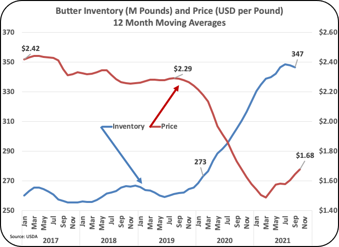
Butter prices have risen significantly through 2019.  Over the full span from 2000 to the present, butter has averaged $1.67 per pound.  The last 12 months have averaged $1.59 per pound.  During the last 10 years, butter prices were at historical highs, averaging $1.96 per pound.  From the year 2000, butter prices have increased only 38 percent, well below inflation for this time span.

Chart and Table IV - Butter Pricing

Dry whey which is used to price "Other Solids" in the component system averaged $.37 per pound over the entire 22-year span.  The price for the last 12 months has risen to $.51 per pound, slightly above the last 10-year average of $.46 per pound.  In 2000, dry whey was worth almost nothing, averaging just $.19 per pound.  The increase to the current price of $.51 per pound represents a 168 percent increase compared to the 2000 price.  

Chart and Table V - Dry Whey Pricing

VALUE OF MILK PROTEIN, BUTTERFAT, OTHER SOLIDS, AND NDM

These above commodities are used to price milk protein, butterfat, and other solids.  The price of milk protein has taken a a rollercoaster ride.  Milk protein is based on the value of cheese and butter.  When cheese prices go up, milk protein goes up in value.  When butterfat prices go up, the price of milk protein goes down.  See this past post for a review of the formulas.

Milk protein has averaged $2.59 per pound over 22 years.  The last 12 months have averaged $3.27 per pound.  In the last decade, when butter prices were high and cheese prices were relatively low, protein was worth $2.72 per pound.  Comparing the last 12 months to the year 2000, the price of milk protein has increased by 93 percent, well in excess of inflation.

Chart and Table VI - Milk Protein Pricing

Butterfat pricing had a very strong run from 2014 to 2019 (Chart I.)  Butterfat is priced based only on the price of butter.  Over the last 12 months, butterfat prices has averaged $1.72 per pound, which is a 38 percent increase over the 22 year span of this analysis.  This is less than the inflation rate of 50 percent.  Over the full span of 23 years, butterfat has averaged is $1.84 per pound, more than the last 12 months average of $1.72 per pound.  

Chart and Table VII - Butterfat Pricing

"Other Solids" pricing is based on the value of dry whey which has been very erratic over the full term of this analysis.  Over nearly 22 years "Other Solids" have averaged just $.20 per pound.  In 2008 and 2009, the value of dry whey was negative, meaning that it cost more to dry the whey than what it was worth after it was dried.  Dry whey is now primarily an export product, and it has gained in value.  For the last 12 months, the "Other Solids" prices averaged $.32 per pound contributing nicely to the Class III price.  That is well above the first year which was just $.05 per pound and well above the inflation rate.  Clearly, new uses have been found for dry whey.

Chart and Table VIII - Other Solids Pricing

NDM pricing has been erratic at times, but on the average, it is very stable over the long run.  NDM prices have increased by only 14 percent in the 22 years of the current Federal Order payment system.  Current prices of $1.15 per pound are just slightly above the full-term price of $1.11 per pound.  

Chart and Table IX - NDM Pricing

MILK PRICES

Class III milk prices has increased by 81 percent over the span of this analysis.  Class is not near to the highs of 2015, but are around $18 per cwt.  This is higher than the Base Class I price.

Chart and Table XI - Class III Pricing

Class IV milk is now extremely important to overall producer milk pricing.  Class IV milk is growing in volume and Class IV skim is used for pricing Class II and it is also used for half of the pricing for Class I.  Class IV skim milk pricing is based solely on the price of NDM.  Since 2020, the price has increased by only 22 precent, well below inflation during that time. 

The low Class IV price is a real problem for overall pricing in Federal Order areas and especially where NDM is produced in large quantities.  Class IV milk is the lowest paid milk.  The Federal Orders that are touching the oceans for shipping are the major Federal Orders impacted.  This includes California, the Pacific Northwest, the Southwest, and the Northeast Federal Orders.

Class IV milk has increased by only 22 percent over the 22 years of the current payment system.

Chart and Table XII - Class IV Pricing

Class I prices have increased by 46 percent since 2020, very close to the inflation increase over that time.  

In 2019, the formula for pricing Class I skim milk was changed.  It now uses an average of the Class III and Class IV skim milk prices.  When the new pricing for Class I milk was developed, it does not appear to have considered the growing long-term difference between Class III skim prices which increased 124 percent over the last 22 yers and the Class IV skim price which increased by only 8 percent during this time.  The difference of $.74 which is included in the new formula is based on historic differences.  Due to the extreme difference in price growth rates for Class III vs. Class IV, the historic difference is quickly out-of-date.  With this in mind, the longer the current formula exists the lower producer milk prices will go.

Chart and Table X - Class I Pricing

SUMMARY

Over nearly 22 years, the original Federal Order pricing methodology has led to changes in producer milk prices.  In 2007 and 2008 the make allowances were increased three times.  When the make allowances are increased, more money goes to the processor and less to the producer.  In 2019, the Class I formula was changed to allow for more specific hedgeing by using an average of Class III and Class IV skim prices to determine the Class I skim price.  Class I milk volume for drinking is shrinking and Class III volume is growing.  NDM has become an export item and the price is now determined by international supply and demand, political events, and currency exchange values.  As a result, de-pooling in the Federal Orders has become huge.   Is it time for a major change?

In general, producer prices are declining.  In 2014 through 2019 butterfat prices were excellent.  Now milk protein is showing consistently high prices.  To get good revenue, producers paid by the Class and Component system need to maximize production of milk protein and butterfat.